
Typography and sound have more in common than you might think. Both are forms of communication that convey messages, evoke emotions, and create experiences. Whether you realize it or not, the way letters and sounds interact can change how you perceive a message. It’s not just about how something looks or sounds — it’s about how they come together to enhance the overall experience. One of the easiest ways to start exploring this relationship is by using the Font Generator. This tool helps you create the perfect typeface to match the mood or tone you want to convey.
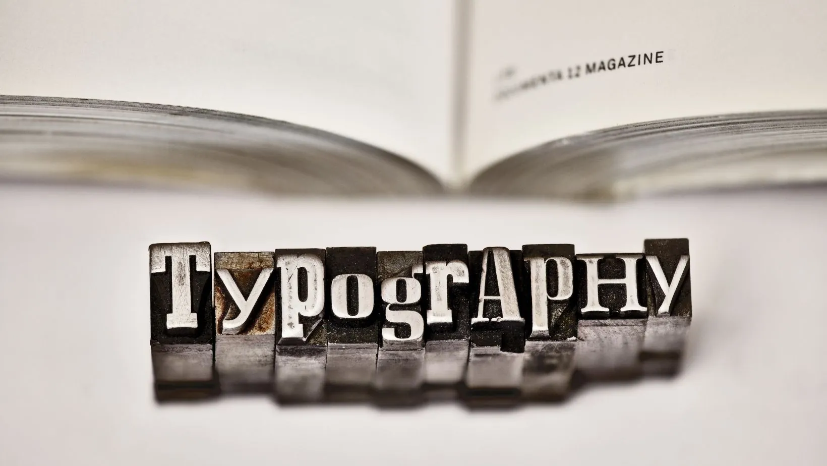
The Power of Typography in Communication
Typography is far more than just the visual aspect of text. It’s a tool that enhances the message you’re trying to communicate. A well-chosen font can immediately convey a feeling or tone before you even read the words. Think about the difference between a bold, capitalized font and a delicate, cursive script. The same message can feel entirely different depending on the font you choose.
Fonts, like sounds, can trigger emotions. A strong, thick font might make a message feel powerful or authoritative, while a soft, flowing script can make it feel elegant or warm. Similarly, a heavy drumbeat might make you feel energized, while a soft melody can bring about calmness. Striking the right font for the right message is essential for creating the intended emotional response.
“Fonts can make or break your project, and choosing the right one — that invokes your branding or message, draws your viewer in and invites them to discover more about what you have to show them — is the best thing you can do for your project.”
This statement from design expert Samantha Cullen emphasizes how crucial the right font is to the success of your design, as it helps establish a strong connection with your audience.
Just like sounds in music, fonts must balance clarity and personality. Imagine trying to read a sentence in a font that’s too complicated or hard to decipher — it would feel like a song that’s too noisy or chaotic. On the other hand, a font that’s too plain might feel uninspiring, like a song without rhythm. Striking the right balance is key.
The fonts you choose are crucial in branding and marketing. Just like the right music can set the tone for a commercial, the right font can influence how a brand is perceived. A tech brand might opt for sleek, modern fonts, while a toy company might choose something playful and whimsical. Fonts are a vital part of creating an identity and connecting with the audience.
Sound and Typography in Digital Media
In the world of digital media, sound and typography often work together to create a cohesive experience. Whether it’s a website, video game, or app, the combination of sound and type can be the key to making something engaging.
Sound design in digital media helps guide the user experience. It gives feedback, adds atmosphere, and emphasizes actions. For instance, the sound of a button click or the background music in a game creates an environment that feels alive. When paired with the right typography, it can turn an ordinary experience into something memorable.
Interactive typography goes a step further. Imagine a website where the font changes in response to sound or mouse movements. This interactive design enhances the user experience, demonstrating how sound and typography can complement each other in real-time, creating a dynamic and engaging interface.
Think of typography as a visual soundtrack. Just like music cues emotions, font choices and movements can set the tone. A well-timed font animation paired with a sound effect can make the experience feel dynamic and exciting. It’s like having a song’s beat mirrored in the way the text moves on screen.
Just like music has rhythm, typography needs rhythm too. When fonts and sounds are consistent, it creates a cohesive experience. Too many changes in font style or sound effects can break the flow and make the experience feel jarring. Consistency is key to keeping the audience engaged and the message clear.
The Relationship Between Music and Typography in Movies
Movies often use both sound and typography to set the scene and convey meaning. When combined, they work together to create a powerful emotional connection. A movie’s title sequence, for instance, is not just about showing the name of the film but also about creating a mood that matches the upcoming experience.
Think about the opening titles of a horror movie. The font might be jagged and dark, while eerie sound effects build suspense. In contrast, a comedy movie might use playful fonts and cheerful music to make the audience feel light-hearted. The relationship between typography and sound helps introduce the audience to the world of the movie.
In movies, typography is often synced with sound for dramatic effect. Fonts may grow larger or change style in time with the music, creating a visual rhythm. This synchronization draws the viewer deeper into the story and enhances the emotional experience. The right timing makes a big difference in how powerful the scene feels.
In animated films, typography and sound work hand-in-hand to convey emotions, humor, and drama. The fonts in animated titles reflect the characters or setting, while sound effects bring them to life. These elements combine to create an immersive experience that resonates with both children and adults alike.
In movies, the fonts displayed during a music cue can amplify the emotions being conveyed. A change in font style during a powerful music moment can heighten the emotional impact of the scene. This interplay between sound and typography adds depth and texture to the overall storytelling experience.
Conclusion
Typography and sound may seem like separate elements at first glance, but when combined, they create something much greater than the sum of their parts. Whether you’re designing a website, creating a game, or making a film, understanding how these two elements work together is essential. A font generator is a great tool to experiment with typography, helping you find the right style to match the sound and mood you want to convey. So next time you work on a project, remember that the fonts and sounds you choose can work hand-in-hand to create a more engaging and emotional experience for your audience.