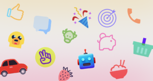


Managing a React component library across multiple product teams often turns into a messy battle. Visual fragmentation creeps in quickly. Developers ship features simultaneously, piling up design debt with every sprint. Team Alpha merges a pull request featuring thick, outlined navigation elements. Then Team Beta pushes a new dashboard full of flat, solid glyphs.
Suddenly, your application looks like a mismatched patchwork quilt.
Standardizing visual language proves difficult for engineering teams lacking a dedicated in-house illustrator. You need total consistency. But you also can’t afford to bottleneck your deployment cycle waiting on custom design tickets.
Enter Icons8. Building visual coherence just got a whole lot easier.
Assembling the Core Component Foundation
Creating a unified system requires a rock-solid baseline set of assets. Every piece must share exact visual parameters to look professional. You’ll usually begin by auditing your current app to map out common UI actions.
Stop downloading files one by one. Navigate the platform by picking a strict visual style framework instead. Selecting a complete pack like Windows 11 Outline guarantees uniform line weights and corner radiuses. Search for core interface actions like saving, deleting, navigating, and editing. Drag each result into a custom Collection right inside your browser window.
Your baseline collection will soon hold fifty or sixty core elements. Now apply a bulk recolor.
Typing in your primary brand HEX code updates the entire batch instantly. Export these files as individual SVGs to your local machine. Wrap those raw vectors into a single, flexible React component. Engineering teams can now pass color and size props dynamically via CSS using `fill=”currentColor”`.
That creates a scalable, rigid foundation for the whole organization.
Sourcing Assets for Sudden Feature Additions
Late Thursday staging deployments often expose missing visual elements. These annoying gaps block releases completely. Product managers might spot a new community integration panel missing crucial platform logos.
Your team needs graphical markers for different messaging channels immediately. They need them fast, matching the exact visual style of your core library.
Frontend developers handle these fires by filtering the platform for their active style pack. Querying the required platforms takes mere seconds. You’ll easily spot standard social logos alongside highly specific gaming assets like discord emojis. Line weights match your application interface perfectly.
Layouts require immediate testing before the final commit. Developers bypass downloading completely by generating a Base64 HTML fragment straight from the interface.
Drop that embedded string directly into your React view. Validating grid spacing and alignment on the staging server happens instantly. Local asset directories stay perfectly clean and free of temporary files.
Evaluating Alternative Icon Systems
Engineering teams usually bootstrap projects with open-source libraries like Feather or Heroicons. Those tools offer exceptionally clean code out of the box. Rendering behaves incredibly predictably.
They’ll also hit a hard scaling limit very fast.
An open-source pack holding three hundred icons works flawlessly for basic blogs. Simple settings menus look absolutely great. Don’t have a visual marker for a niche database integration or a specific medical device? Those tiny libraries come up entirely empty.
Designers treat the Noun Project as the classic backup option for finding obscure assets. It houses a massive volume of community uploads.
One major tradeoff exists: total lack of structural coherence. Searching for a user profile graphic yields hundreds of results. Every single one features different structural grids, padding rules, and stroke widths.
Relying on an in-house design team provides absolute brand alignment. Asset quality remains incredibly high. Unfortunately, it introduces a severe operational bottleneck. Forcing five product teams to wait on one illustrator to draw every minor feature destroys your deployment pipeline velocity.
Icons8 bridges that gap beautifully. Their catalog offers 45 distinct visual styles, each holding over 10,000 unique icons. Massive volume inside a strict framework means developers find highly specific graphical metaphors instantly. Nobody breaks the visual rules of your application ever again.
Generating Component State Variants Directly
Interface elements rarely exist in a single static state. React applications frequently require multiple graphic variations to communicate changing system statuses. A basic folder icon might need a successful upload version. Another version must indicate a synchronization error.
Stop opening external vector software to modify base graphics. Generate these exact variants right inside your browser. Clicking any icon launches a dedicated editor workspace.
Start by picking your base folder graphic. Grab the subicon tool next. Overlay a smaller checkmark graphic onto the bottom right corner of the primary shape. Precise scaling and positioning take only a few quick clicks.
Duplicate the process for your error state. Just swap the checkmark for an alert symbol.
Adjust the padding slider to scale your composite graphic. Ensure the new combined bounding box aligns perfectly with your standard 24×24 pixel component grid. Uncheck the simplified SVG setting before downloading anything. Retaining raw, editable vector paths remains crucial for animating individual subicons later with CSS transitions.
When to Look Beyond the Library
Strict boundaries exist here. Engineering teams must acknowledge them before committing their entire frontend infrastructure.
Free tiers operate purely as evaluation tools. They mandate external attribution links and cap PNG downloads at a microscopic 100px resolution. More importantly, they restrict access to SVG files completely outside of a few specific categories. Production React applications demand scalable vector graphics for crisp rendering across all device pixel ratios. Teams must buy a paid subscription to unlock those crucial formats.
Adopting third-party libraries forces you into specific aesthetic paradigms.
Maybe your product relies heavily on abstract, highly stylized visual metaphors. Standard library assets won’t work there. They’ll feel far too literal and rigid for your brand identity.
Volume introduces massive governance challenges too. Giving raw platform access to five different product teams invites pure chaos. Someone must explicitly mandate that all developers pull exclusively from the Material Outlined category. Otherwise, a junior dev will inevitably download a totally mismatched asset from the 3D Fluency pack.
That single mistake instantly recreates the exact visual fragmentation you tried to solve.
Implementation Tactics for Frontend Workflows
Integrating an external asset library requires a few tactical adjustments. Daily workflows must adapt when introducing strict version control.
- Install the Pichon Mac application to bypass the web browser entirely. Dragging and dropping assets directly into your code editor saves countless hours during intense sprint cycles.
- Use CDN link formats for rapid frontend prototyping. Append customization parameters straight into the URL string to test live color changes before bundling final production SVGs.
- Keep background preview toggles active when applying custom brand hex codes. Verifying contrast ratios against both light and dark modes prevents accessibility failures in your application interface.
- Run search by image functions using screenshots of legacy interface elements. Forcing the system to locate the closest structural match inside your newly adopted style framework prevents old tech debt from creeping back in.